

We’re a curious bunch, so we’re always on the lookout for campaigns and pop culture moments we can learn from. Thankfully, ideas are everywhere these days. We’ve taken our creative team’s most Slacked-about stuff from the month of June and awarded our favorites (for better or worse) with superlatives.
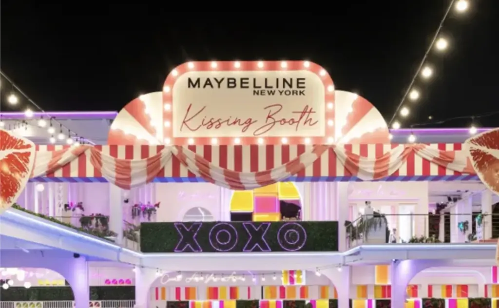
MOST HONEST REBRAND
HBO Max.
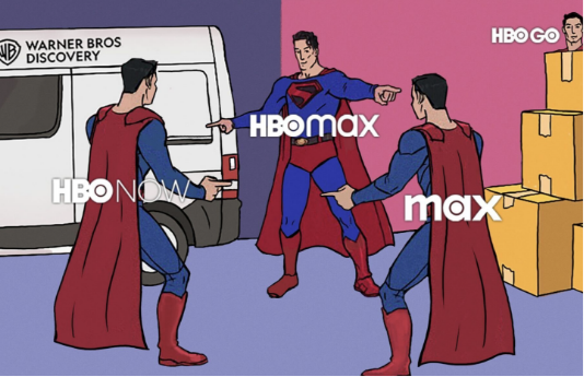
This social media launch campaign went viral for its self-deprecating humor. After announcing it was reverting to the name HBO Max, the streaming platform posted a series of memes poking fun at its evolution. By embracing the perception of the name change, it took control of the narrative and got the internet buzzing with organic reach. And, of course, it tapped some of its top talent to appear in the content. Read more
BEST SPOOF CAMPAIGN
Cat jewelry.
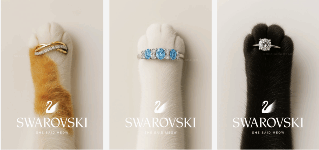
While Swarovski didn’t actually create this campaign, we like that it shows the unique concepts AI can bring to life. Without AI, creating this image would take hours of specialized Photoshop work. With these new photo-generation tools, we can quickly vet — no pun intended — our creative ideas with more accurate examples.
BEST CONCEPTING VIBES
Our team’s top songs.
Sharing music in Slack is our love language. Enjoy the eclectic mix of songs we’ve been grooving to while we work lately.
- Sugar in Your Gas Tank – Less Than Jake
- Timshel – Mumford & Sons
- Got to Be Mine – Vulfmon
- Cradle the Pain – Morgan Nagler
- The Richest Man in the World – Ben Rector
- Talk is Cheap – Dr. Dog
- Mr Nice Guy – Scoundrels
MOST BRAND PLACEMENTS IN A SHOW
Love Island USA.
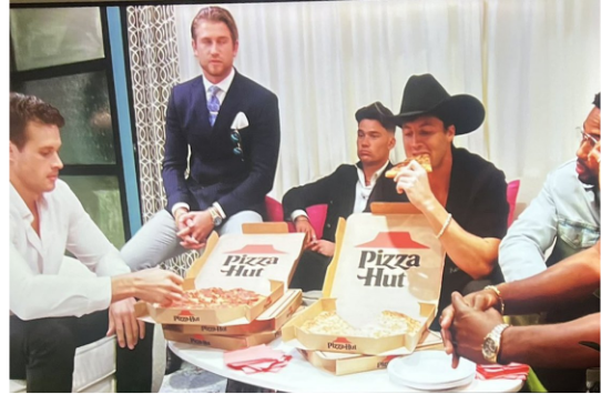
Fans of reality TV are no strangers to product placement and heavy-handed sponsorships these days, but the most recent season of “Love Island USA” takes it to a whole new level. Peacock, the home of the show, has partnered with at least a dozen brands. It’s practically a Russian nesting doll of 6- to 30-second promos, many of which use an ad format that features a QR code viewers can scan to shop directly while they watch. Read more
MOST PUBLIC DESIGN CRIME
The Pope’s tombstone.
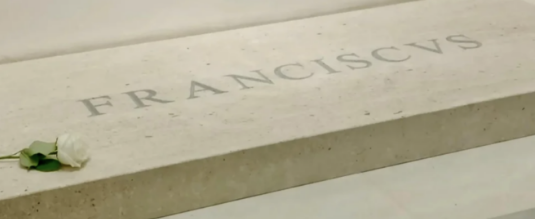
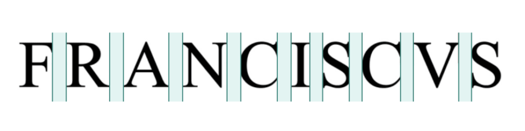
As designers, it’s not uncommon to kern (adjust the spacing) between the letters in a headline or logo. Why? Take the example of Pope Francis’ tombstone. Instead of clearly spelling out FRANCISCVS, the lack of proper kerning makes it read more like “F R A NCISC VS.” It’s a designer’s nightmare — literally etched in stone. Read more
BEST BRAND BUILDER
Pink’s Window Services.
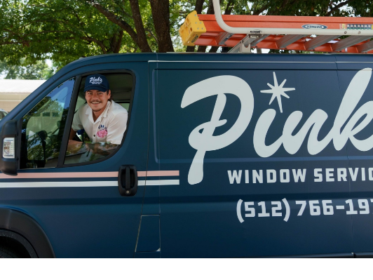
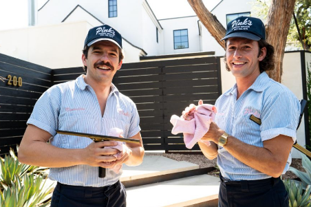
Pink’s is a master class in brand consistency for franchises. Everything about its 1950s-inspired appearance reinforces its commitment to world-class, friendly service at a fair price. And you’ll see that style and voice carried through every aspect of its presence — from uniform design to the language in confirmation texts. Bravo! Learn more